The coolest part of the decoration shows are the adaptable ideas. Come see what you can make easy copying of Casa Cor Rio 2015!
In the 2015 edition of Casa Cor Rio we saw a very strong trend: do-it-yourself. Heads up! This does not mean a product that looks cheap or poorly made. It means a product with a unique face, handmade, possible to reproduce at home.
The truth is that this is a trend that has been growing very strong in the decoration market. Especially because, let’s combine, a personalized product just for / by you is exclusive, and that is luxury. 😉
Let’s review together some of the DIY / DIY references (or not so much, but that you can definitely reproduce at home) that we saw there?
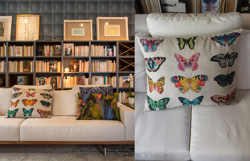
The Chef’s Office, an environment signed by Andrea Duarte and Anna Malta is very cozy. And part of it is because of these beautiful pillows. Especially the butterfly cushion which, in the store, should cost more than our own sofa, but we can make it similar. Not sure how? Simple! Just get transfer paper + pillow cover + image of brabuletas and tchans.
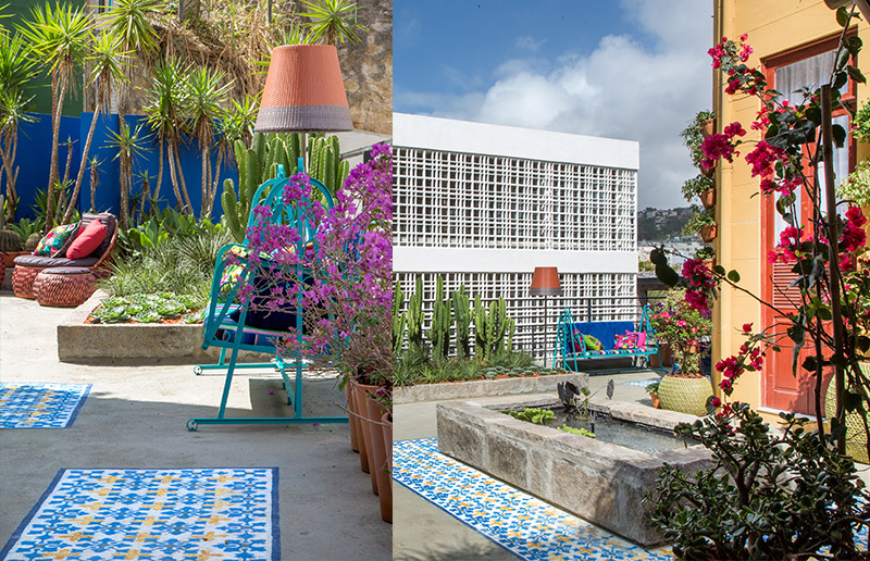
This is a great idea for those who have an open space that can “undergo” interventions. Look at the floor of this garden signed by Paula Bergamin. Got it? That “rug” is actually a painting on the floor made with stencil dcoracao.com what is more is post talking about how to make stencil, with tips and inspirations.

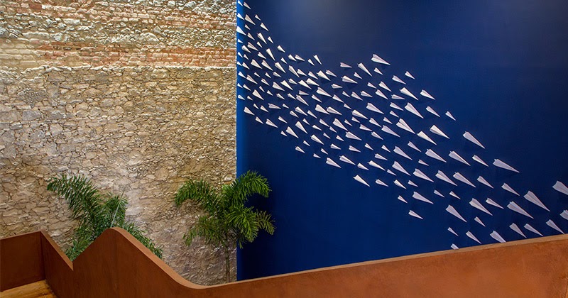
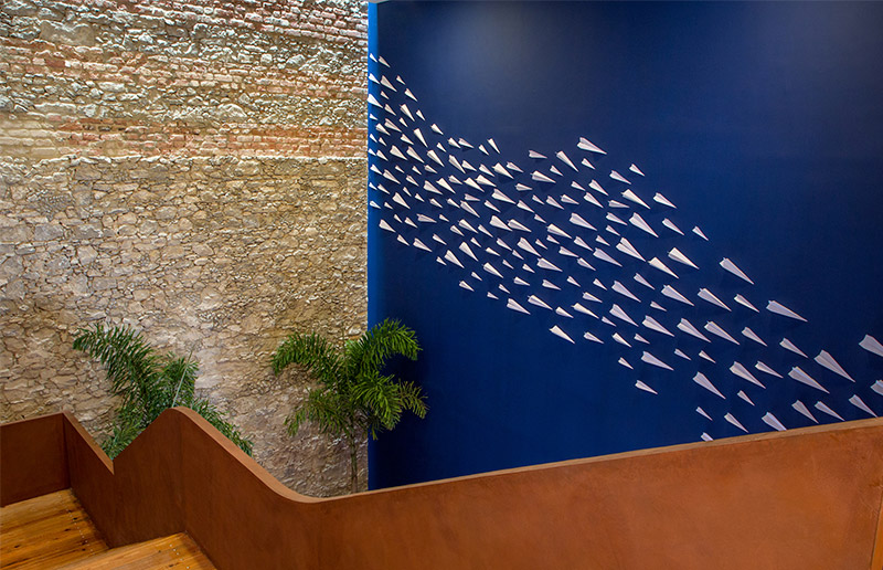
A simpler and cheaper idea than that, with such a cool effect, honestly, we don’t know if it exists. The architect Erick Figueira de Mello transformed a wall that could be just passing through into one that everyone wants to take a picture of. It is like? Folding airplane paper sheets. To do remembering school days, right?
It is the type of decoration that would be a hit at any party :-). And if someone insinuates that it is out of place, you have at least 2 arguments. 1- if you can at Casa Cor, why can’t you at home? 2- are paper sculptures / folds / 3d planes. They work like an art installation 😉
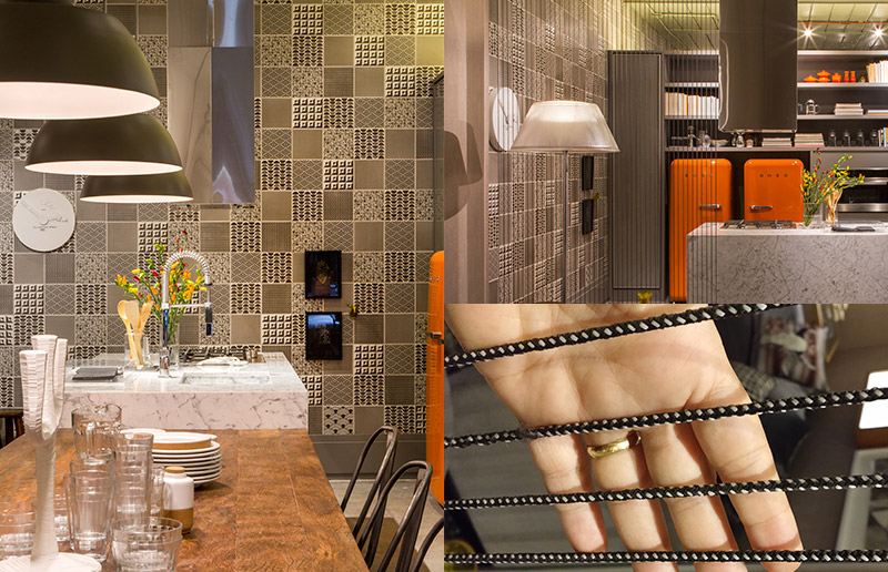
Chef’s Loft designed by Bianca da Hora used something that touches a lot of people’s hearts: hydraulic tiles (did I hear a sigh there?), But to bring a cooler vibe, she used all the black and white prints. You must be wondering how changing the tile can be something easy to do with your own hands, right ?! Good, tile stickers!
In addition, another point for space was the use of these strings as a room divider. Cool because it works, it doesn’t take up space, it’s cheap and easy to do the same.
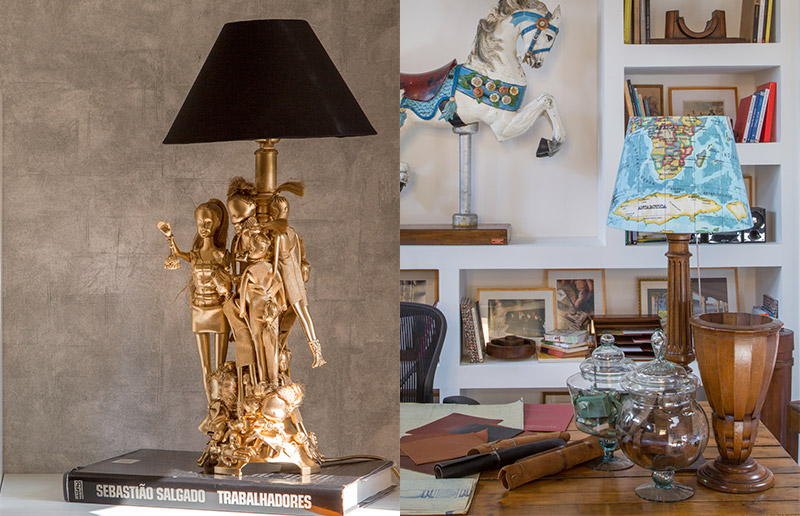
These were the two objects that inspired us to write this post. The first, a lamp with toys that was in Emmilia Cardoso’s Solar Room, which you can make similar using a lampshade + dolls + gold spray paint + extra-strong glue. Super modern! There’s even a video that teaches you how to do it, look:
The second in the photo above, in Raphael Costas Bastos’s environment, you can do similar using lampshade dome + printed fabric, or even old maps.
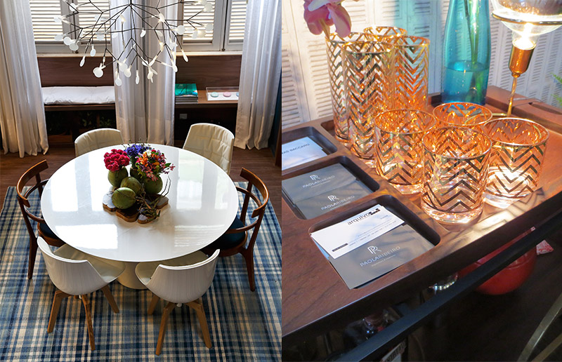
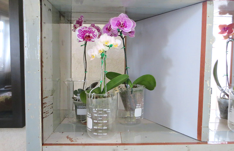
Speaking of vase, you’re looking for a different and unusual flower pot? So take advantage of this tip from Gisele Taranto’s space and use a becker to accommodate your friends.
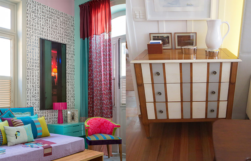
Still in Pedro’s environment, Carlotta Oddone’s curtains are beautiful and special, after all they are all unique daughters, made with fabrics imported from all over the world. Buying straight from the source is cool, but if you kept your eyes long and sad, thinking about the price, you can fix it by taking a walk in the fabric store! Mix fabrics of different colors and prints in a creative patchwork it’s great!
The dresser in the Living Room, designed by Bitty Talbot and Cecília Teixeira, was bought like this, but it is super easy to make a similar one, right. Renovating the dresser is always a good idea. And there are several tips for renovating painted furniture here!
Want to see more of Casa Cor 2015? Here is much more!
Photos: Denilson Machado and dcoracao.com.
